Lift Tracker
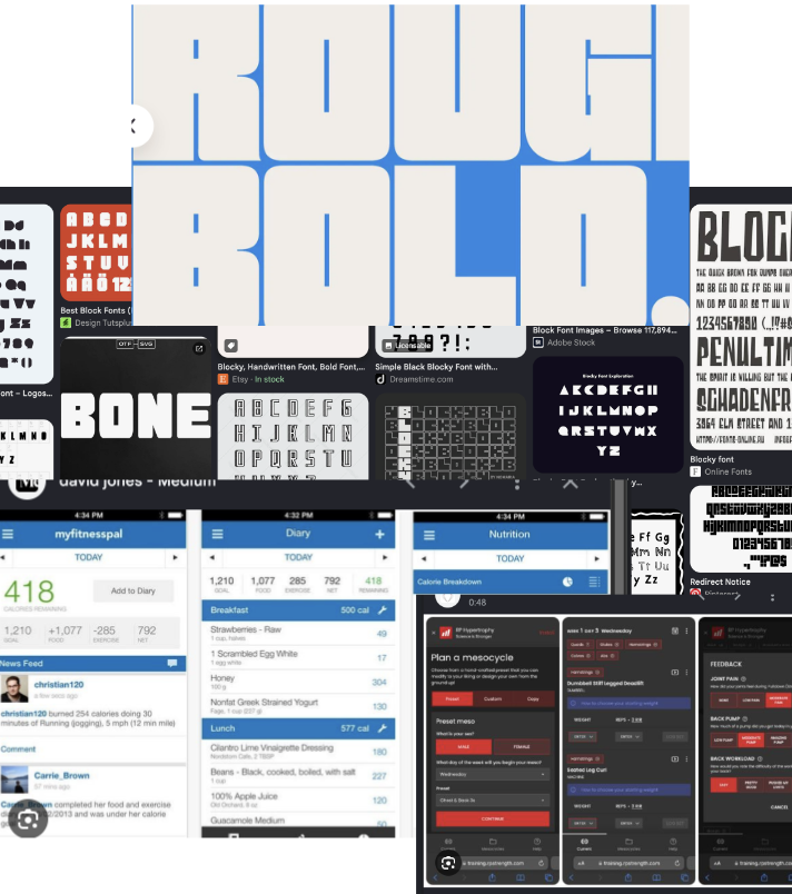
Early visual references for Lift Tracker: blocky display type, dense mobile dashboards, and dark training interfaces.
The visual language of Lift Tracker came from paying attention to apps and interfaces I already liked using, then being honest about which parts actually helped me. The goal was never to copy one source directly. It was to learn from familiar patterns: the density of fitness dashboards, the immediacy of quick mobile controls, the punch of blocky display type, and the confidence of dark, high-contrast interfaces.
That is how most personal tools get their shape. We use similar apps, notice what feels motivating or efficient, leave out the pieces that get in our way, and add the details we wish those apps had. Lift Tracker's design language grew from that kind of selective borrowing: heavy, direct, compact, and built around the way I actually train.
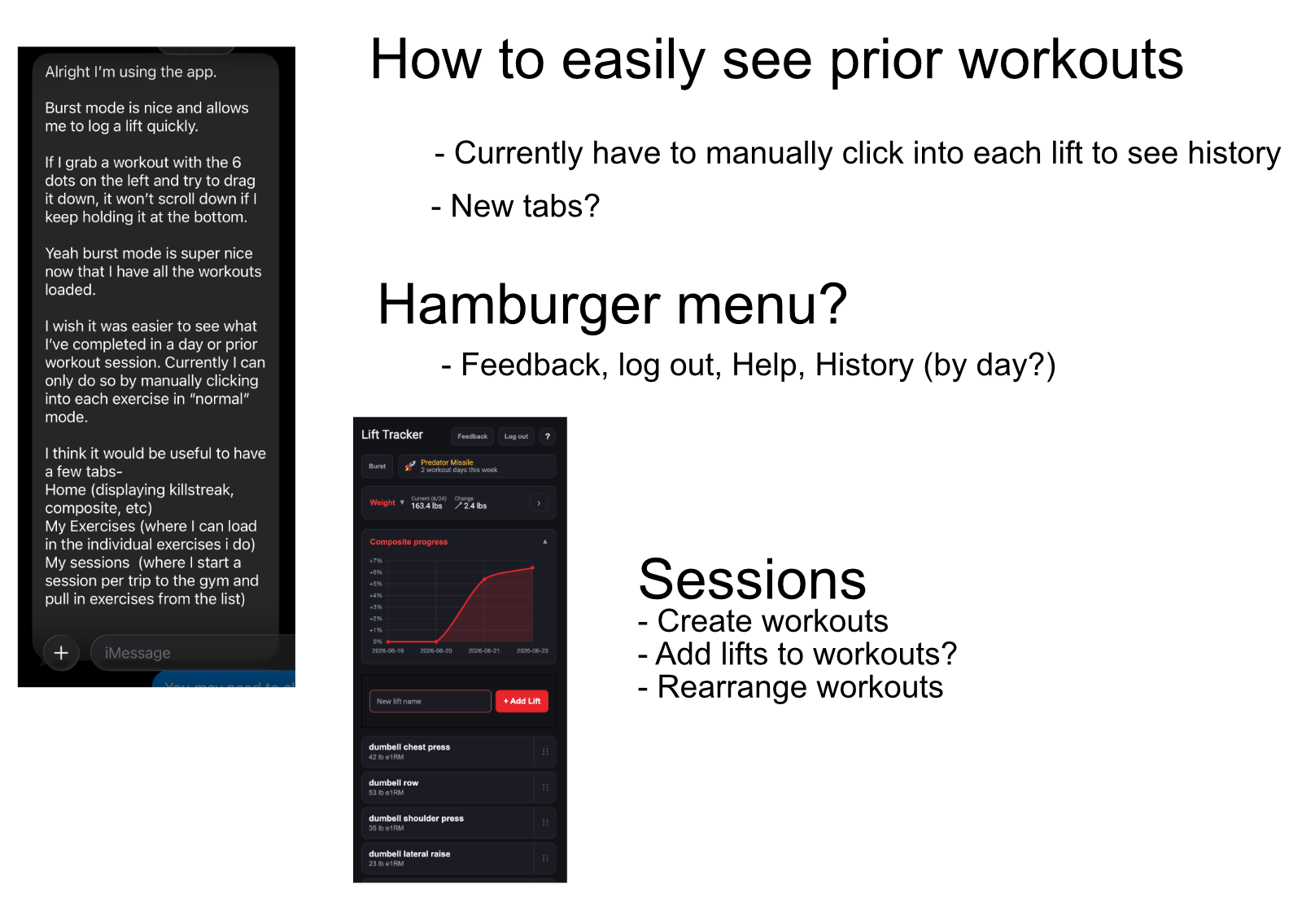
Working notes from a single session of using the app and writing down what was annoying, confusing, or missing.
Most of Lift Tracker's roadmap didn't start as a polished spec. It started as raw notes taken straight from using the app myself: friction points, half-formed ideas, and questions about what to build next. Keeping the input this loose mattered, because the next step was feeding it directly into an AI coding session rather than translating it into a formal ticket first.
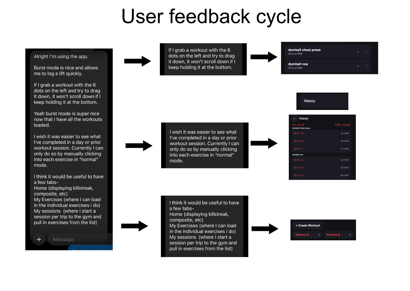
User feedback was immediately broken into component parts, with each request systematically addressed in minutes. From a one-line complaint to a shipped feature (and its own UI) in the same session.
This diagram traces one actual feedback cycle end to end: a user's text message about wanting an easier way to see workout history led to a working feature, complete with its own UI, in the same sitting. There was no backlog, no sprint planning, and no separate design pass.
The gap between "this is annoying" and "this is fixed" was minutes, not weeks.
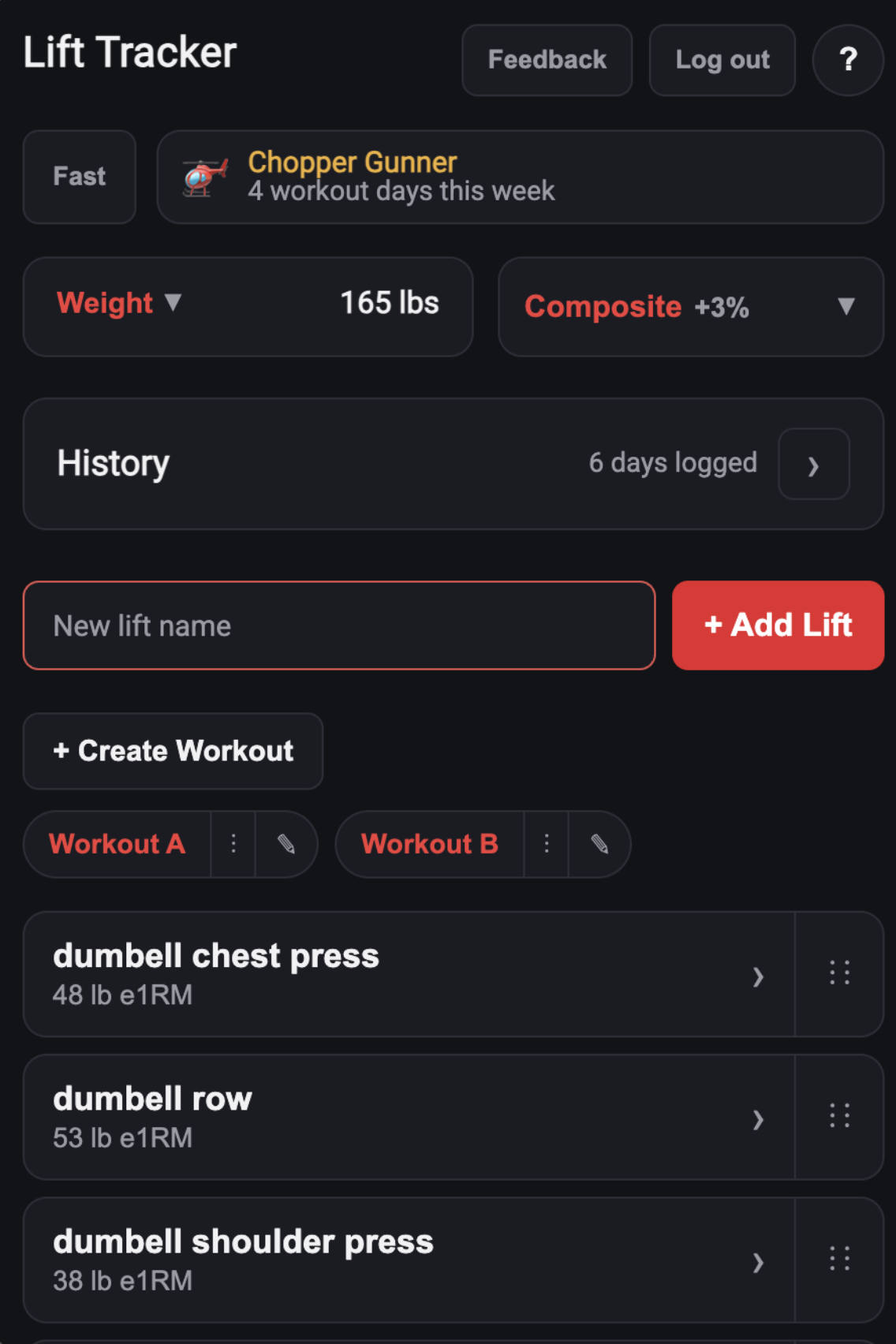
The current list view: lifts grouped into workouts, drag-to-reorder, and a Fast-mode toggle for rapid-fire logging.
That cycle, repeated dozens of times, is how Lift Tracker actually got built. Drag-to-reorder came from not wanting to scroll past finished lifts. Fast-mode's rapid-log rows came from wanting to log a set without opening anything. Workout grouping and pill filters came from training different splits on different days and wanting to see just one. Even the composite score above the lift list started as a simple question: am I actually getting stronger, or does it just feel that way?
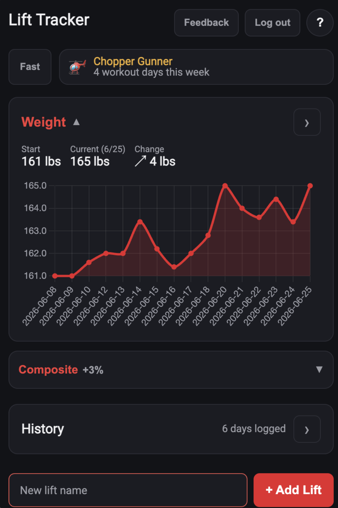
Weight tracking and the composite score, expanded. One of many features that started as a one-line ask.
As of writing, this workflow has shipped well over 100 individual features and fixes: weight and waist tracking, per-user accounts, a day-grouped workout history, gamified weekly streaks, full-history export, and dozens of smaller polish passes, with several sometimes shipping in a single day.
The point isn't that AI wrote the code unsupervised. It's that the loop from "I noticed this" to "this is live" got short enough that almost nothing is too small to fix.
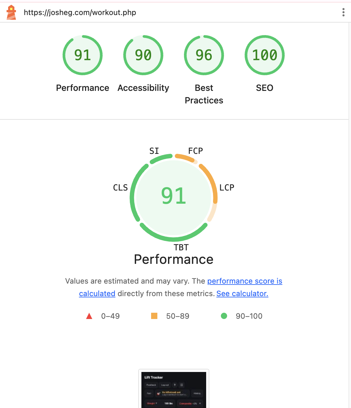
A Lighthouse audit of the live app after a focused performance pass: 91 Performance, 90 Accessibility, 96 Best Practices, and (briefly) 100 SEO.
Performance got the same treatment as everything else here: notice something slow, fix it, ship it. A Lighthouse audit on the live app turned up four distinct bottlenecks stacked on top of each other -- a charting library loaded synchronously before anything could paint, seventeen separate unbundled JavaScript files being discovered and fetched one at a time, no caching policy on any of those assets, and a perfect-but-pointless SEO ceiling caused by the app's own privacy setting.
Each got its own fix, not a blanket one: deferring the chart library and dropping an unused Google Fonts request cleared the render-blocking problem; bundling and minifying the JavaScript with esbuild cut it from roughly 147KB spread across seventeen requests down to a single ~66KB request; scoped, versioned cache headers meant returning visitors stopped re-downloading assets they already had. The SEO score shown here was captured with the app's noindex flag briefly lifted to confirm the ceiling really was just that flag -- it's back in place by default, since this is a personal tool and not something meant to show up in search results.
Early visual references for Lift Tracker: blocky display type, dense mobile dashboards, and dark training interfaces.
The visual language of Lift Tracker came from paying attention to apps and interfaces I already liked using, then being honest about which parts actually helped me. The goal was never to copy one source directly. It was to learn from familiar patterns: the density of fitness dashboards, the immediacy of quick mobile controls, the punch of blocky display type, and the confidence of dark, high-contrast interfaces.
That is how most personal tools get their shape. We use similar apps, notice what feels motivating or efficient, leave out the pieces that get in our way, and add the details we wish those apps had. Lift Tracker's design language grew from that kind of selective borrowing: heavy, direct, compact, and built around the way I actually train.
Working notes from a single session of using the app and writing down what was annoying, confusing, or missing.
Most of Lift Tracker's roadmap didn't start as a polished spec. It started as raw notes taken straight from using the app myself: friction points, half-formed ideas, and questions about what to build next. Keeping the input this loose mattered, because the next step was feeding it directly into an AI coding session rather than translating it into a formal ticket first.
User feedback was immediately broken into component parts, with each request systematically addressed in minutes. From a one-line complaint to a shipped feature (and its own UI) in the same session.
This diagram traces one actual feedback cycle end to end: a user's text message about wanting an easier way to see workout history led to a working feature, complete with its own UI, in the same sitting. There was no backlog, no sprint planning, and no separate design pass.
The gap between "this is annoying" and "this is fixed" was minutes, not weeks.
The current list view: lifts grouped into workouts, drag-to-reorder, and a Fast-mode toggle for rapid-fire logging.
That cycle, repeated dozens of times, is how Lift Tracker actually got built. Drag-to-reorder came from not wanting to scroll past finished lifts. Fast-mode's rapid-log rows came from wanting to log a set without opening anything. Workout grouping and pill filters came from training different splits on different days and wanting to see just one. Even the composite score above the lift list started as a simple question: am I actually getting stronger, or does it just feel that way?
Weight tracking and the composite score, expanded. One of many features that started as a one-line ask.
As of writing, this workflow has shipped well over 100 individual features and fixes: weight and waist tracking, per-user accounts, a day-grouped workout history, gamified weekly streaks, full-history export, and dozens of smaller polish passes, with several sometimes shipping in a single day.
The point isn't that AI wrote the code unsupervised. It's that the loop from "I noticed this" to "this is live" got short enough that almost nothing is too small to fix.
A Lighthouse audit of the live app after a focused performance pass: 91 Performance, 90 Accessibility, 96 Best Practices, and (briefly) 100 SEO.
Performance got the same treatment as everything else here: notice something slow, fix it, ship it. A Lighthouse audit on the live app turned up four distinct bottlenecks stacked on top of each other -- a charting library loaded synchronously before anything could paint, seventeen separate unbundled JavaScript files being discovered and fetched one at a time, no caching policy on any of those assets, and a perfect-but-pointless SEO ceiling caused by the app's own privacy setting.
Each got its own fix, not a blanket one: deferring the chart library and dropping an unused Google Fonts request cleared the render-blocking problem; bundling and minifying the JavaScript with esbuild cut it from roughly 147KB spread across seventeen requests down to a single ~66KB request; scoped, versioned cache headers meant returning visitors stopped re-downloading assets they already had. The SEO score shown here was captured with the app's noindex flag briefly lifted to confirm the ceiling really was just that flag -- it's back in place by default, since this is a personal tool and not something meant to show up in search results.